US Stocks: Goldman’s Grim Forecast
David Kostin of Goldman Sachs is scaring everybody this week.
Whereas the US market has risen by 13% annually for the past 10 years, Goldman Sachs’ Chief US Equity Strategist expects it to deliver just 3% annually for the next 10 years.
That would be just 1% in “real” (i.e., inflation-adjusted) terms if we assume inflation moderates to the Fed’s targeted 2% per annum.
Will David be right?
On one hand, your knee-jerk reaction for virtually any economic forecast, particularly one spanning 10 years, should be to chuckle, at least mildly. I’ve talked about how bad forecasts are before on the BBAE Blog.
Forecasts aren’t guaranteed to be wrong. Forecasters tend to be smart, and have access to plenty of data and advanced statistical methods. But simply because economics is a social science, and the track record of economic predictions is laughable.
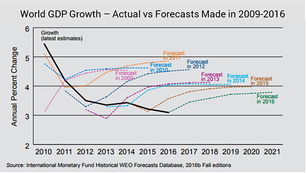
For example: Actual global GDP growth steadily declined from 2010 to 2016. But analysts kept predicting “up and a little bit out from here.”
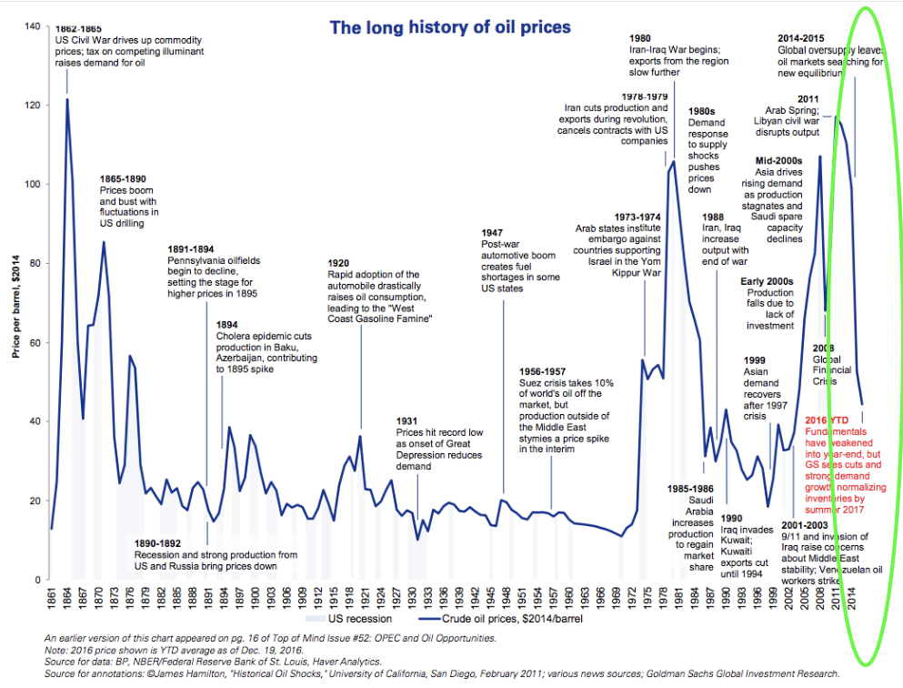
Almost a mirror image occurred with rising oil prices – which, to be fair, probably seemed so much higher than normal that analysts said: “OK, that’s enough: Oil prices will just be flat from here.”
And judging by the evolution of their predictions, it seems that after years of being proven wrong by continually rising oil prices, their narrative morphed only slightly: “Oil prices have clearly risen so much that they will probably rise a little bit more first – and then be flat from there. Yep, we’ve got your number, and you can’t fool us anymore, oil prices.”
Except they did.
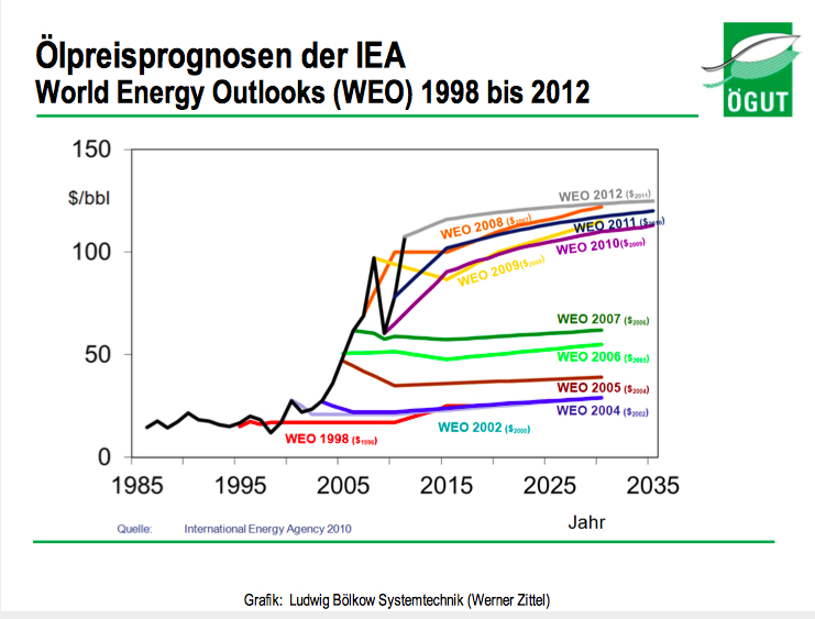
In fact, after analysts finally capitulated and decided higher-for-longer was, indeed, the new reality for oil prices, what did oil prices do?
They plunged.
The below graphic shows too many years, but the rightmost part, which I circled in lime green, shows the oversupply-induced plunge.
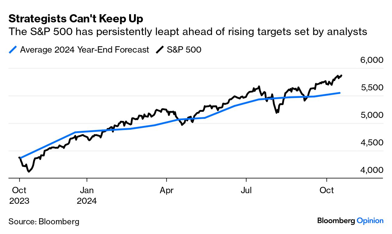
Coming back to stock market Earth, as a Bloomberg graph shows, even in the short-term, analysts have been fairly wrong about the S&P 500, too.
On the other hand, let’s be humble and look at some data.
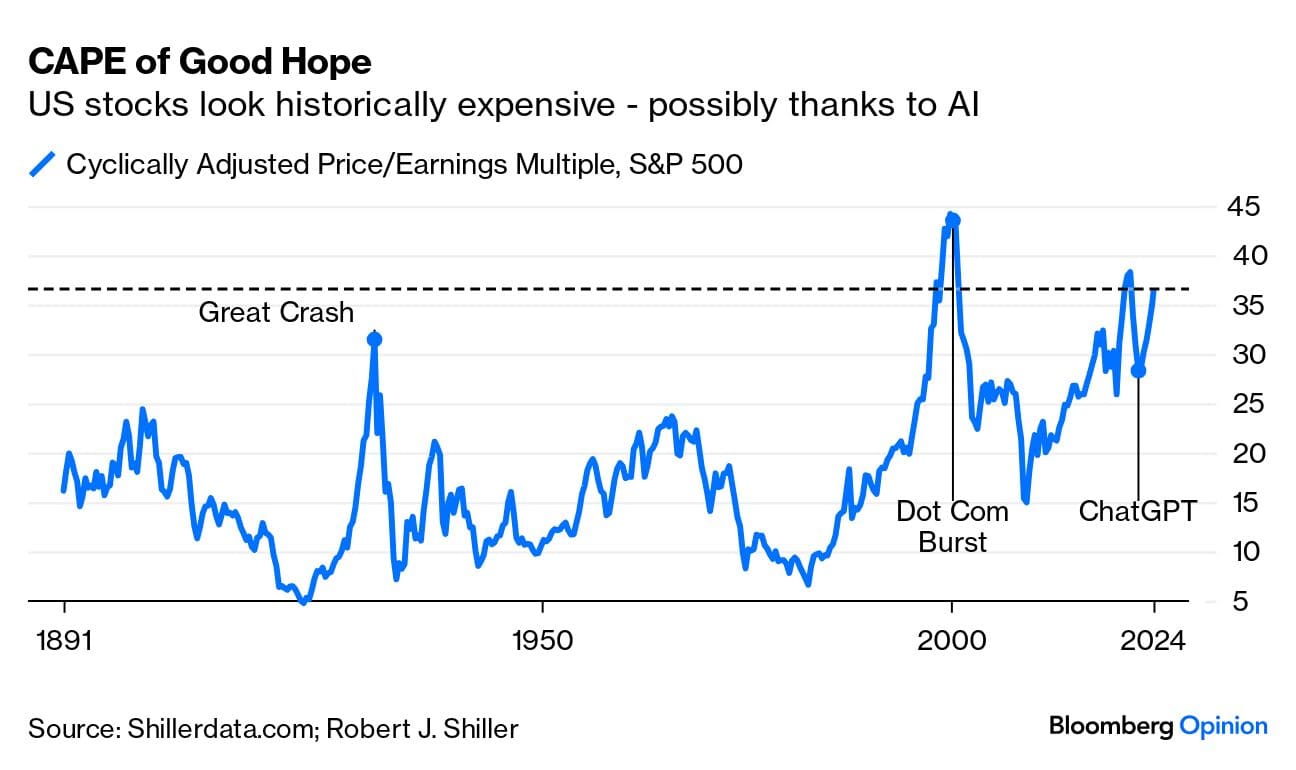
Bloomberg also has some good visuals on Shiller P/E or cyclically adjusted P/E (CAPE) for the S&P 500. CAPE, as we’ve mentioned before, uses an average of the past 10 years of earnings, adjusted for inflation. This smooths out bumps and some literature has shown it to be better correlated with stock price movements than regular P/E.
And it’s relatively high now:
What might that mean, exactly?
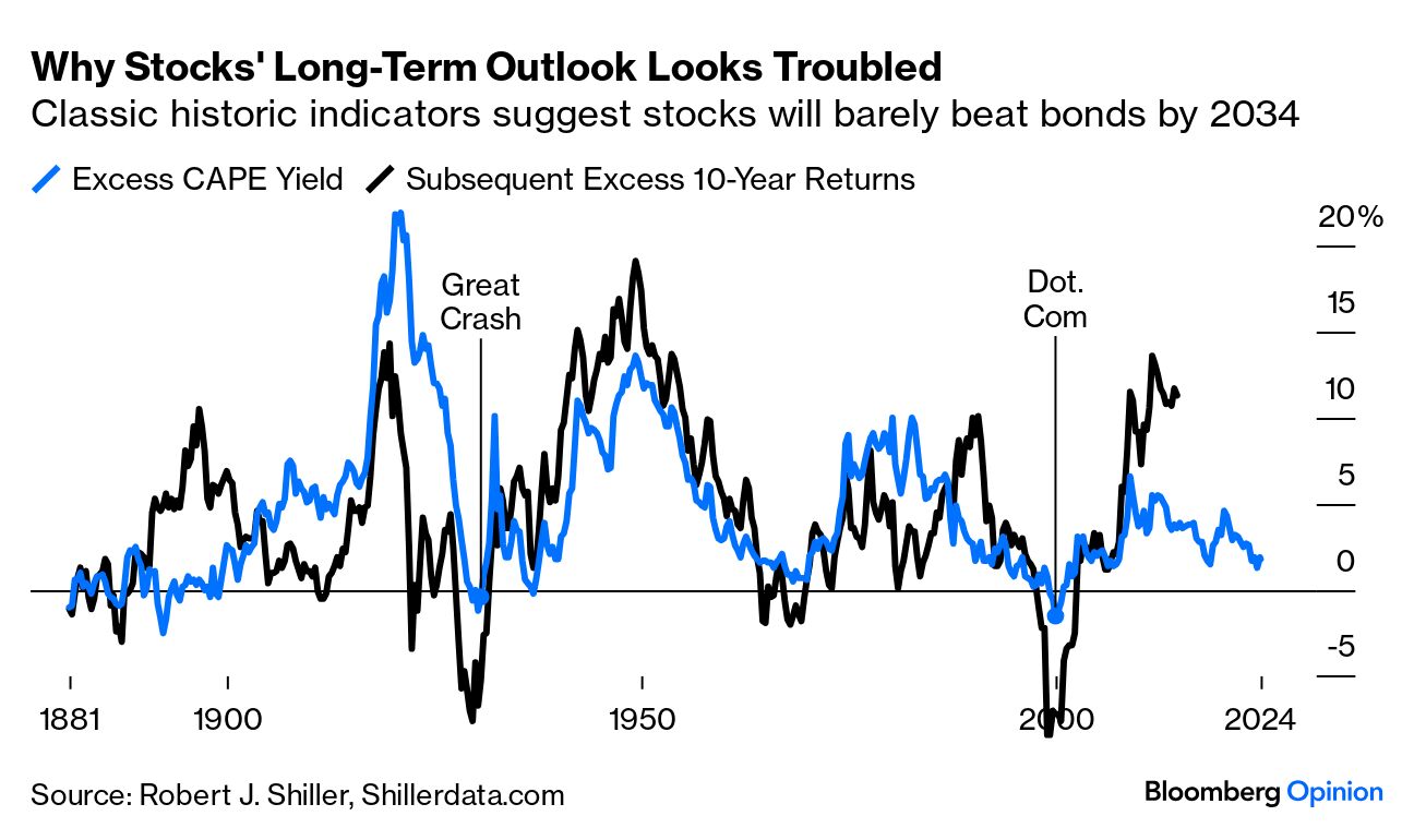
Bloomberg looks next at something called excess CAPE yield, and compares it to the 10-year US Treasury yield. Regular earnings yield for a stock is just the inverse of P/E: A $100 stock with $10 in EPS would have a 10 P/E (100/10), and a 10% earnings yield (10/100).
CAPE yield is just the CAPE version of this: Swap out last year’s earnings for a 10-year average and inflation-adjust. Then, for a rough valuation proxy, compare this equity market “yield” to the risk-free government bond yield (10 years might be a loose proxy for how long people should own stocks, and it’s also a more stable rate than short-term Treasuries).
So if 10-year US government bonds are paying, say, 3%, and the CAPE yield is 7%, the “excess” CAPE yield would be 4 percentage points.
The intuition is that a cheap market will have a high CAPE yield; investors are getting a lot of earnings for a relatively lower price, and vice versa: A pricey market will have a low CAPE yield because investors are paying a lot for tiny earnings.
The blue line below is this excess CAPE yield. Each “point” on the black line represents the next decade of “excess” returns, which I’m guessing Bloomberg is defining as either excess stock performance over Treasury performance or excess cumulative equity yield over Treasury yield (or, less likely, excess risk-adjusted performance from equities).
In other words, stocks were cheap in 1950 and performed well for the next 10 years, whereas stocks were expensive in 2000 and performed poorly for the next 10 years.
So where are we now?
The excess CAPE yield isn’t the very lowest it’s ever been, but it’s on the lower end of the range, which might mean that stock valuations have gotten ahead of their skis and will need a decade of below-average returns to “earn into” their current valuations.
What a difference a year makes
One perspective might be that if you’re using trailing 10-year numbers for [insert any variable here], it’s matchy-matchy to compare that to returns over the following 10 years.
It is matchy-matchy. It’s numerically aesthetic. But I’m not sure it’s necessarily logical.
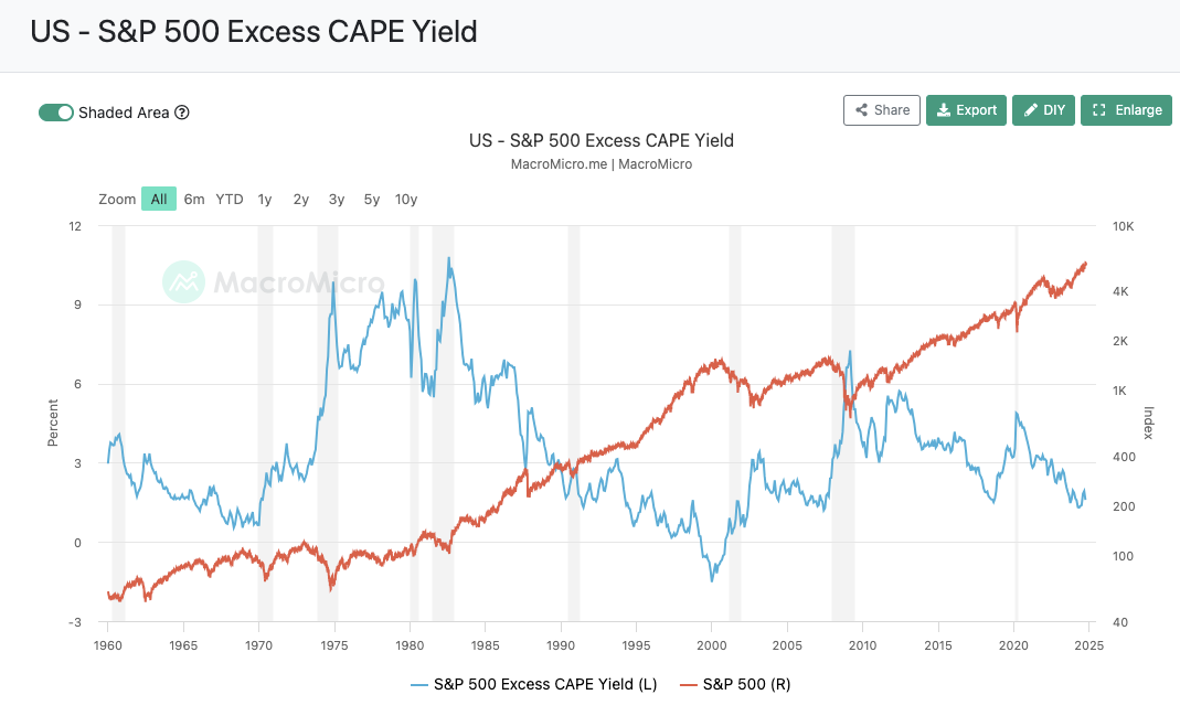
If we just disregard the whole “10 years out” bit, as MacroMicro.me has done in the below chart, and look at excess CAPE yield and current-time market performance, at least from 1960 to present, it doesn’t look that bad.
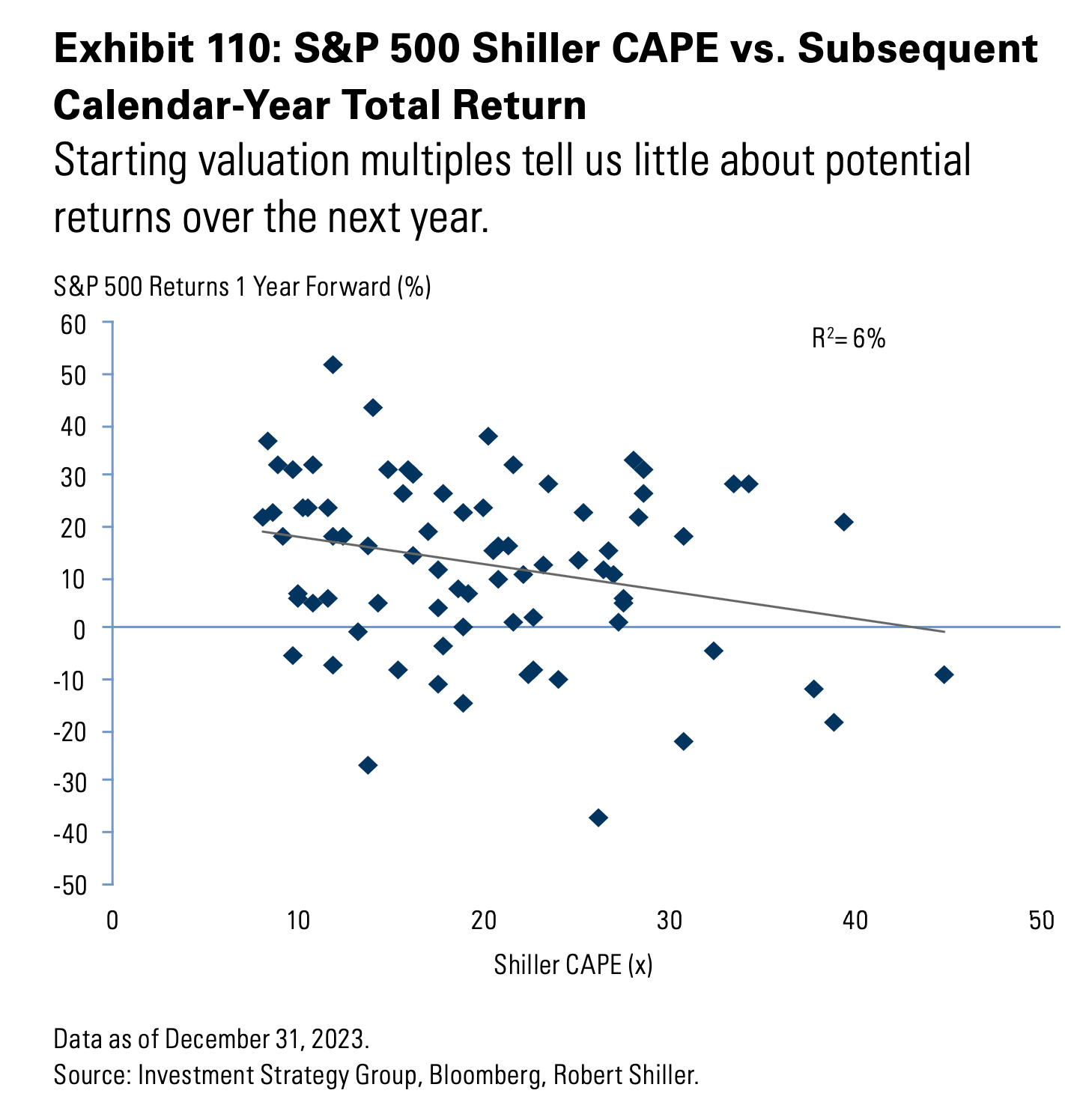
As further visual proof of this, see this below graphic from Sam Ro of Tker.co, which plots year-ahead S&P 500 returns (vertical axis) against CAPEs (horizontal axis).
If you’re into statistics, you know that an R2 of 6% means very little of one variable is explained by the other – not even close to a predictive relationship, in other words. And if you’re not into statistics (explainer here), you can just eyeball the graph and see that the data points are basically all over the place, and that there’s no clear pattern between CAPE and one-year-ahead returns.
So which time-period view is right?
If the market is supposed to be so-so over the next 10 years, but over the next year, anything goes, it may be that both time-period views are right.
Just remember: It’s all based on forecasts.
This article is for informational purposes only and is neither investment advice nor a solicitation to buy or sell securities. All investment involves inherent risks, including the total loss of principal, and past performance is not a guarantee of future results. Always conduct thorough research or consult with a financial expert before making any investment decisions. Neither the author nor BBAE has a position in any investment mentioned.
