Weekly Roundup: Benevolent CPI, Benevolent Volatility, Uber
Volatility: Good for Future Stock Returns?
Just over a week ago, the US stock market pulled a move you’d normally see only in professional wrestling: It got body slammed – and then quickly got right back up.
If you’re new to investing, you may be surprised to know that “inside” of price – or, technically, as a derivative of price – lies essentially a miniature asset class, which many investors watch, and which some trade exclusively: volatility.
In fact, I remember from my hedge fund days that some investors trade the volatility of volatility – the “vol of the vol” – and there’s even an index that tracks that now.
Volatility usually reduces value.
For example, imagine a house is worth $1,000,000 now. In Scenario A, it’ll be worth $1,000,000 in one year. In Scenario B, it’ll be worth either $2,000,000 or $0.
Even though both scenarios have the same expected value – $1,000,000 – and Scenario B potentially has a big payoff, the risk of a wipeout would lead most people to choose A, at least with their bread-and-butter money.
That’s an extreme example, but even $1.5m/$500k or $1.2m/$800k payoffs embed the same dynamic: Adding uncertainty is a negative, and most investors would want a higher expected value to compensate for it.
(One exception is in pricing stock options, for which volatility is good because it increases the probability that an option will end up in the money. Another might be the small subset of investors who are actually risk-seeking – not people who are simply willing to take more risk for potentially more reward, but people who see the risk as a perk, which is not many.)
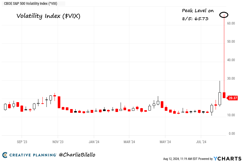
Back to volatility, Charlie Bilello of Creative Planning found that while volatility may still be “bad,” it tends to lead to higher subsequent stock returns.
The market body slam of 10 days ago was the third largest three-day spike (which seems like a curious time period, but it’s what Charlie chose) on record. Charlie’s visual puts this spike in perspective:
But as you can see on the chart below, on average, in the year following big three-day volatility spikes, the market has risen 18%, which is well above average.
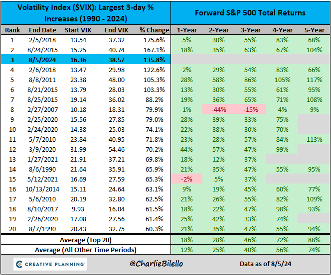
Now, remember the pro wrestling bit: The market got slammed, but then got right back up over the following several days.
The market had its single-largest four-day volatility drop (yep, I wonder if mixing “three-day” and “four-day” is data mining a bit) as things settled down.
And interestingly enough, the subsequent-year returns following volatility plunges are also materially above average, if slightly less so than those following volatility spikes: 15.2%.
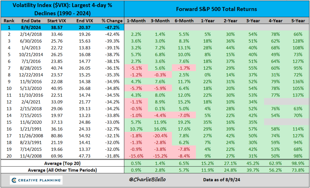
So in other words, although volatility is bad, stock returns following periods when – and I’m extrapolating slightly – the “vol” or the vol of the vol is high have tended to be good.
The nit-picker in me would still wonder:
- Why three-day and four-day, specifically? How different are one-day, two-day, and three-day pari passu next-year returns? Just curious.
- Is a shorter time period between when volatility increased and then decreased quickly correlated with higher returns? In other words, is shooting up and then quickly shooting down more auspicious than shooting up and slowly trickling down (logically, it might be, because a gradual decline would seem to signal lingering concerns, versus a one-off “whoops” spike).
Nit-picking aside, Charlie’s potential data mining does seem like good news, all else equal. Just remember that in investing, nothing else is ever equal and overriding factors can and do pop up.
Inflation Now Below 3%
The Federal Reserve has two mandates:
- Price stability, which does not literally mean stable prices, but instead means prices that increase by about 2% per year and, after semi-recent pronouncements, not even steadily 2% but 2% in a ballpark, long-term-average-ish sense, and
- Full employment, which does not literally mean that all workers are employed, but instead means that nobody is out of a job because of an economic slowdown reducing demand for workers. At least that’s one definition of it. There are others.
Employment has hovered close to 50-year highs over the past few years, even though unemployment spiked in July, so until very recently, most people have been watching inflation to gauge how well the Fed has been doing.
Inflation has been slightly stubborn in getting to 2%, but the just-released July CPI number (technically, for the trailing year ending July 31) was 2.9% – the lowest since 2021 – so the Fed is getting closer.
And after doubting the Fed for some time, the market now believes inflation isn’t a worry:
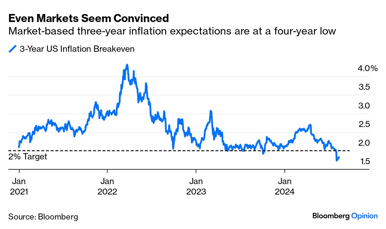
As a bonus, US inflation is already below 2% if we remove shelter costs – the buoy that’s been keeping the number high.
CNBC made a graphic showing that prices of many things are actually deflating, rather than just slowing their rate of increase. The graphic below just shows some non-food and energy items that are deflating (food and energy are often removed from inflation figures for analysis, as they’re especially volatile):
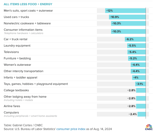
I’m slightly surprised that “men’s suits” is still on the list.
Anyway, this moderating inflation may seem like a nothingburger, and that’s the point: Investors want steady, moderate progress on this sort of thing, with extremes avoided.
If inflation weren’t going down enough, the Fed would aim to keep interest rates higher for longer, which would keep stock values down. The market has already been worried that the Fed is slightly lagging many of its fellow central banks in cutting rates. If inflation were going down too quickly, that might seem good on the surface, but at least some contingent of investors would worry that overly high rates had knocked the US economy into some downward spiral. The Fed might chop rates to compensate, which would seem panicky, and you’d have a lot of people worried about how bad things are or are going to get.
With interest rates and with meeting new animals, think: no sudden movements.
Uber Doing What a Company Should Do
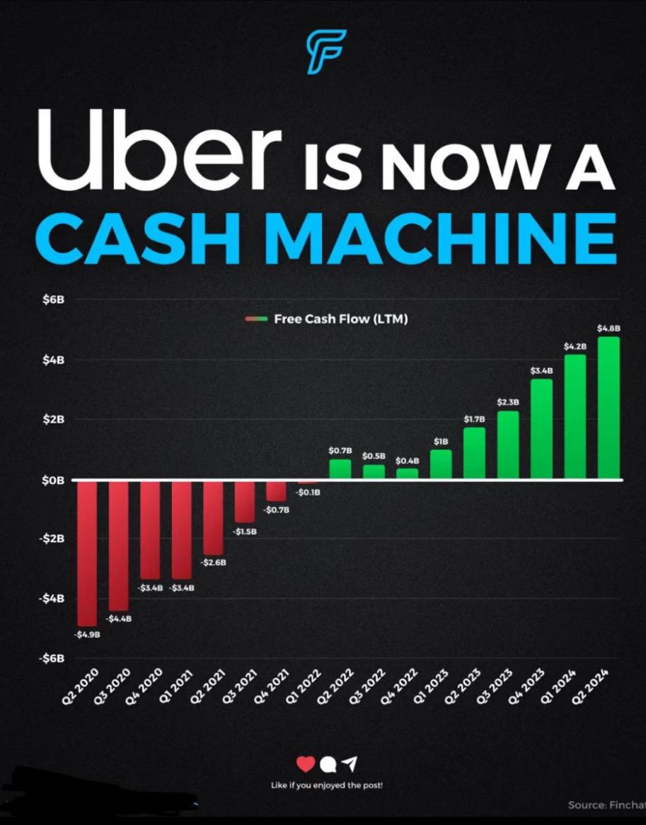
This isn’t really about Uber (Nasdaq: $UBER) as much as it is about stocks in general, but when I saw this Finchat graphic (as shared by the GRIT newsletter) I was just struck by the fact that sometimes – not always, and I’m not exactly sure how often – plans actually come to pass.
I remember guest writing about Uber five or six years ago for my friend Caleb’s newsletter while he was on vacation; at the time, Uber was a big experiment. Its business model was entirely unproven and the company was losing money hand over fist.
I’m not sure if the second quarter of 2020 was deliberately chosen to show near-perfect symmetry in the graph below – it probably was – but all the same, it shows that sometimes, companies actually do swing to free cash flow positive and reward their owners as planned:
This article is for informational purposes only and is neither investment advice nor a solicitation to buy or sell securities. All investment involves inherent risks, including the total loss of principal, and past performance is not a guarantee of future results. Always conduct thorough research or consult with a financial expert before making any investment decisions. Neither the author nor BBAE has a position in any investment mentioned.


